On any given day, most of our email inboxes are flooded with a barrage of automated email newsletters that do little else besides giving us another task to do on our commutes to work — namely, marking them all as unread without reading, or unsubscribing altogether.
But every now and then, we get a newsletter that’s so good, not only do we read it, but we click it, share it, and recommend it to our friends.
Click here to download our free template for planning and tracking your email marketing efforts.
What Makes an Effective Email Marketing Campaign?
Effective email marketing campaigns need to be cleverly written to attract attention in busy inboxes. Here are three things your next email campaign should have.
Personalization and Imagery
Marketing emails need to be personalized to the reader and filled with interesting graphics. Few people want to read emails that are addressed “Dear Sir/Madam” — as opposed to their first or last name — and even fewer people want to read an email that simply gives them a wall of text. Visuals help your recipients quickly understand what the point of the email is.
Responsive Design
Effective email marketing campaigns are designed for all devices on which users can read their emails — desktop, tablet, and smartphone. Email campaigns that are designed for mobile devices are especially important — a quality known as “responsive design.” In fact, 67% of emails today are read on either a smartphone or tablet.
An Appropriate Call-to-Action
Above all, exceptional marketing emails must contain a meaningful call-to-action (CTA). After all, if brands are taking up subscribers’ time — and inbox space — with another email, every message must have a point to it. Internet users get multiple emails per day — why should they care about yours?
You probably receive enough emails as it is, and it’s tough to know which newsletters are worth subscribing to, so we’ve curated a list of some of our favorite examples. Read on to discover some great email campaign examples and what makes them great — or just skip ahead to the brands you already know and love.
But first, download the planning template you’ll need to craft your own lovable email marketing campaign, and check out our new Out-of-Office Email Generator to make your email address even more delightful to your contacts.
- charity: water: Donation Progress Update
- Brooks Sports: Desiree Linden’s Boston Marathon Victory
- BuzzFeed: ‘BuzzFeed Today’ Newsletter
- Uber: Calendar Integration
- TheSkimm: Subscription Anniversary
- Mom and Dad Money: Get to Know Your Subscribers
- Poncho: Custom Weather Forecast
- Birchbox: Co-marketing Promotion
- Postmates: New Product
- Dropbox: User Reengagement
1. charity: water
Marketing Campaign: Donation Progress Update
When people talk about email marketing, lots of them forget to mention transactional emails. These are the automated emails you get in your inbox after taking a certain action on a website. This could be anything from filling out a form, to purchasing a product, to updating you on the progress of your order. Often, these are plain text emails that marketers set and forget.
Well, charity: water took an alternate route. Once someone donates to a charity: water project, her money takes a long journey. Most charities don’t tell you about that journey at all — charity: water uses automated emails to show donors how their money is making an impact over time. With the project timeline and accompanying table, you don’t even really need to read the email — you know immediately where you are in the whole process so you can move onto other things in your inbox.

2. Brooks Sports
Marketing Campaign: Desiree Linden’s Boston Marathon Victory
When Desiree Linden won the 2018 Boston Marathon, she became the first American woman to win the race in more than 30 years. To her shoe and apparel sponsor, Brooks Sports, it was an opportunity to celebrate their long partnership together. The resulting email campaign focuses almost entirely on the Olympic marathoner’s amazing accomplishment.
Email campaigns like this one allow companies to demonstrate their loyalties and add value to the products their best users have chosen. The blue CTA button at the bottom of the email reads, “See Desiree’s go-to gear.” What better products to call attention to than the stuff worn by America’s latest legend?
After Desiree’s victory, everyone knew her name. Brooks Sports struck while the iron was hot with a proud email that was sure to be opened and forwarded.

3. BuzzFeed
Marketing Campaign: ‘BuzzFeed Today’ Newsletter
I already have a soft spot for BuzzFeed content (“21 Puppies so Cute You Will Literally Gasp and Then Probably Cry,” anyone?), but that isn’t the only reason I fell in love with its emails.
First of all, BuzzFeed has awesome subject lines and preview text. They are always short and punchy — which fits in perfectly with the rest of BuzzFeed’s content. I especially love how the preview text will accompany the subject line. For example, if the subject line is a question, the preview text is the answer. Or if the subject line is a command (like the one below), the preview text seems like the next logical thought right after it:

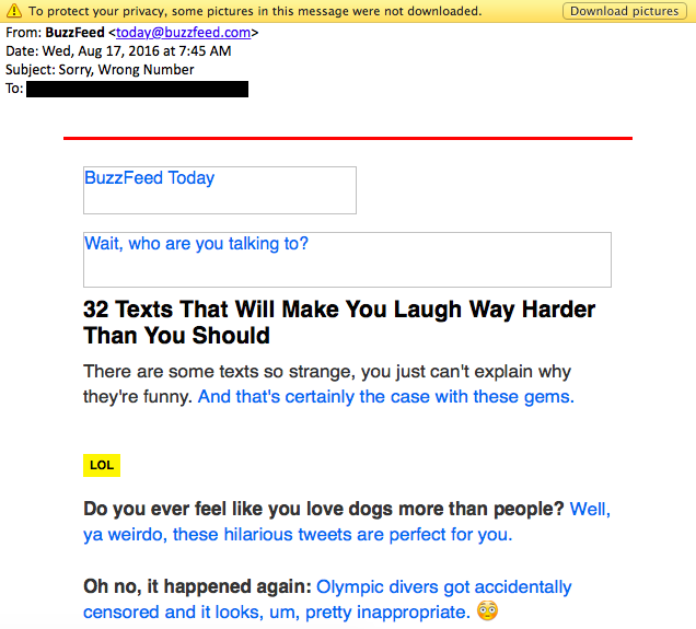
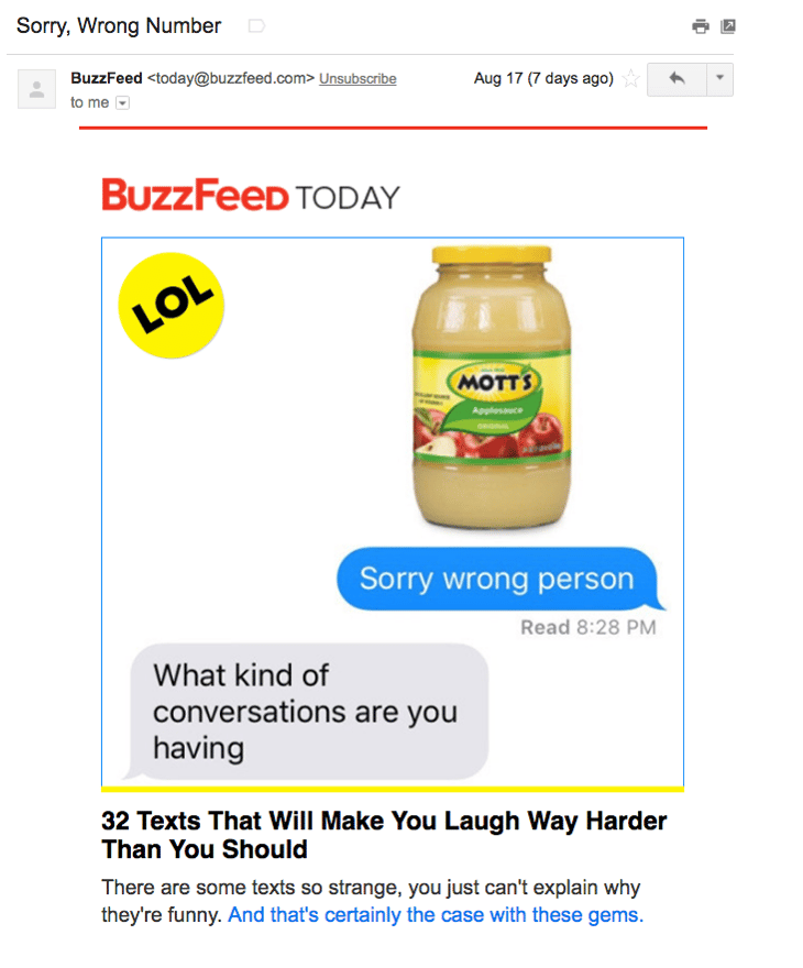
Once you open up an email from BuzzFeed, the copy is equally awesome. Just take a look at that glorious alt text action happening where the images should be. The email still conveys what it is supposed to convey — and looks great — whether you use an image or not. That’s definitely something to admire.
Without images:
With images:
4. Uber
Marketing Campaign: Calendar Integration
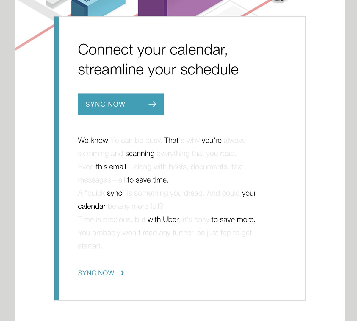
The beauty of Uber‘s emails is in their simplicity. Email subscribers are alerted to deals and promotions with emails like the one you see below. We love how brief the initial description is, paired with a very clear CTA — perfect for subscribers who are quickly skimming the email.
For the people who want to learn more, these are followed by a more detailed (but still pleasingly simple), step-by-step explanation of how the deal works.
We also love how consistent the design of Uber’s emails is with its brand. Like its app, website, social media photos, and other parts of the visual branding, the emails are represented by bright colors and geometric patterns. All of its communications and marketing assets tell the brand’s story — and brand consistency is one tactic Uber’s nailed in order to gain brand loyalty.
Check out the clever copywriting and email design at work in this example:
5. TheSkimm
Marketing Campaign: Subscription Anniversary
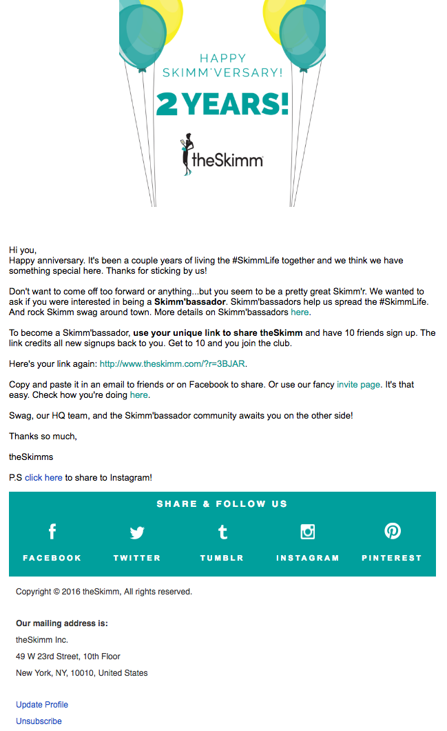
We love TheSkimm’s daily newsletter — especially its clean design and its short, punchy paragraphs. But newsletters aren’t TheSkimm’s only strength when it comes to email. Check out its subscriber engagement email below, which rewarded fellow marketer Ginny Mineo for being subscribed for two years.
Emails triggered by milestones, like anniversaries and birthdays, are fun to get — who doesn’t like to celebrate a special occasion? The beauty of anniversary emails, in particular, is that they don’t require subscribers to input any extra data, and they can work for a variety of senders. Plus, the timeframe can be modified based on the business model.
Here, the folks at TheSkimm took it a step further by asking Mineo if she’d like to earn the title of brand ambassador as a loyal subscriber — which would require her to share the link with ten friends, of course.
6. Mom and Dad Money
Marketing Campaign: Get to Know Your Subscribers
Think you know all about the people who are reading your marketing emails? How much of what you “know” about them is based on assumptions? The strongest buyer personas are based on insights you gather from your actual readership, through surveys, interviews, and so on — in addition to the market research.
That’s exactly what Matt Becker of Mom and Dad Money does — and he does it very, very well.
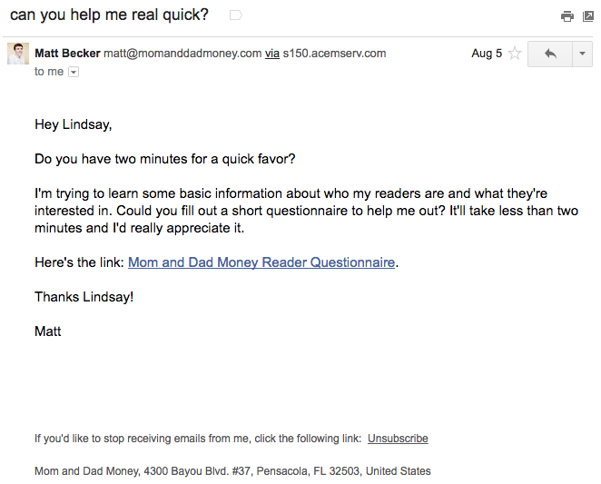
Here’s an example of an email I once received from this brand. Design-wise, it’s nothing special — but that’s the point. It reads just like an email from a friend or colleague asking for a quick favor.
Not only was this initial email great, but his response to my answers was even better: Within a few days of responding to the questionnaire, I received a long and detailed personal email from Matt thanking me for filling out the questionnaire and offering a ton of helpful advice and links to resources specifically catered to my answers. I was very impressed by his business acumen, communication skills, and obvious dedication to his readers.
7. Poncho
Marketing Campaign: Custom Weather Forecast
Some of the best emails out there pair super simple design with brief, clever copy. When it comes down to it, daily emails I get from Poncho — which sends me customizable weather forecasts each morning — takes the cake.
Poncho’s emails are colorful, use delightful images and GIFs, and are very easy to scan. The copy is brief but clever with some great puns, and it aligns perfectly with the brand. Check out the copy near the bottom asking to “hang out outside of email.” Hats off to Poncho for using design to better communicate its message.

8. Birchbox
Marketing Campaign: Co-marketing Promotion
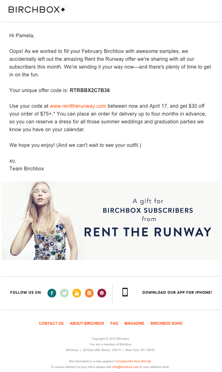
The subject line of this email from beauty product subscription service Birchbox got my colleague Pam Vaughan clicking. It read: “We Forgot Something in Your February Box!” Of course, if you read the email copy below, Birchbox didn’t actually forget to put that discount code in her box — but it was certainly a clever way to get her attention.
As it turned out, the discount code was actually a bonus promo for Rent the Runway, a dress rental company that likely fits the interest profile of most Birchbox customers — which certainly didn’t disappoint. That’s a great co-marketing partnership right there.
9. Postmates
Marketing Campaign: New Product
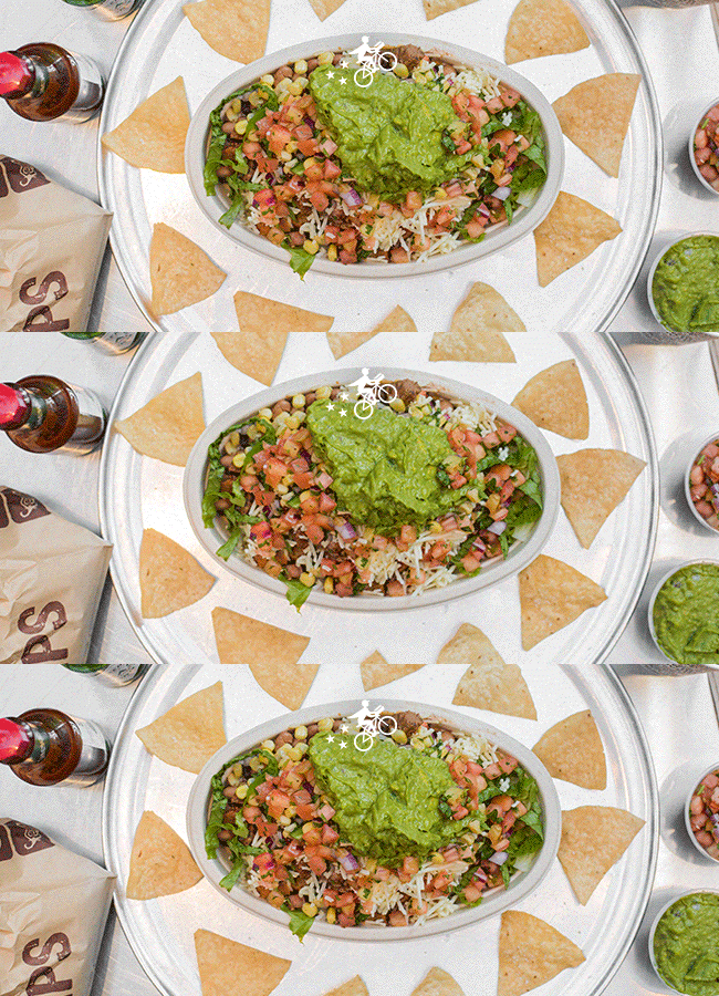
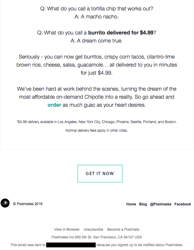
I have to say, I’m a sucker for GIFs. They’re easy to consume, they catch your eye, and they have an emotional impact — like the fun GIF in one of Postmates‘ emails that’s not only delightful to watch, but also makes you crave some delicious Chipotle.
You, too, can use animated GIFs in your marketing to show a fun header, draw people’s eyes to a certain part of the email, or display your products and services in action.
10. Dropbox
Marketing Campaign: User Reengagement
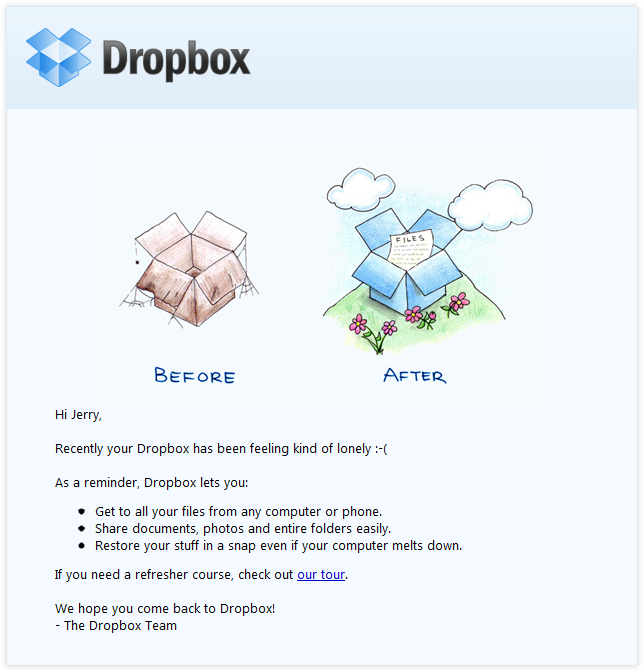
You might think it’d be hard to love an email from a company whose product you haven’t been using. But Dropbox found a way to make its “come back to us!” email cute and funny, thanks to a pair of whimsical cartoons and an emoticon.
Plus, the email was kept short and sweet, to emphasize the message that Dropox didn’t want to intrude — it just wants to remind the recipient that the brand exists, and why it could be helpful. When sending these types of email, you might include an incentive for recipients to come back to using your service, like a limited-time coupon.
